There would be hardly anyone, who would not like to have a website portal in this era! This era is governed by technology and several of its benefits.
One thing that people can never get rid of is the habit of using as many resources as available and putting it into use.
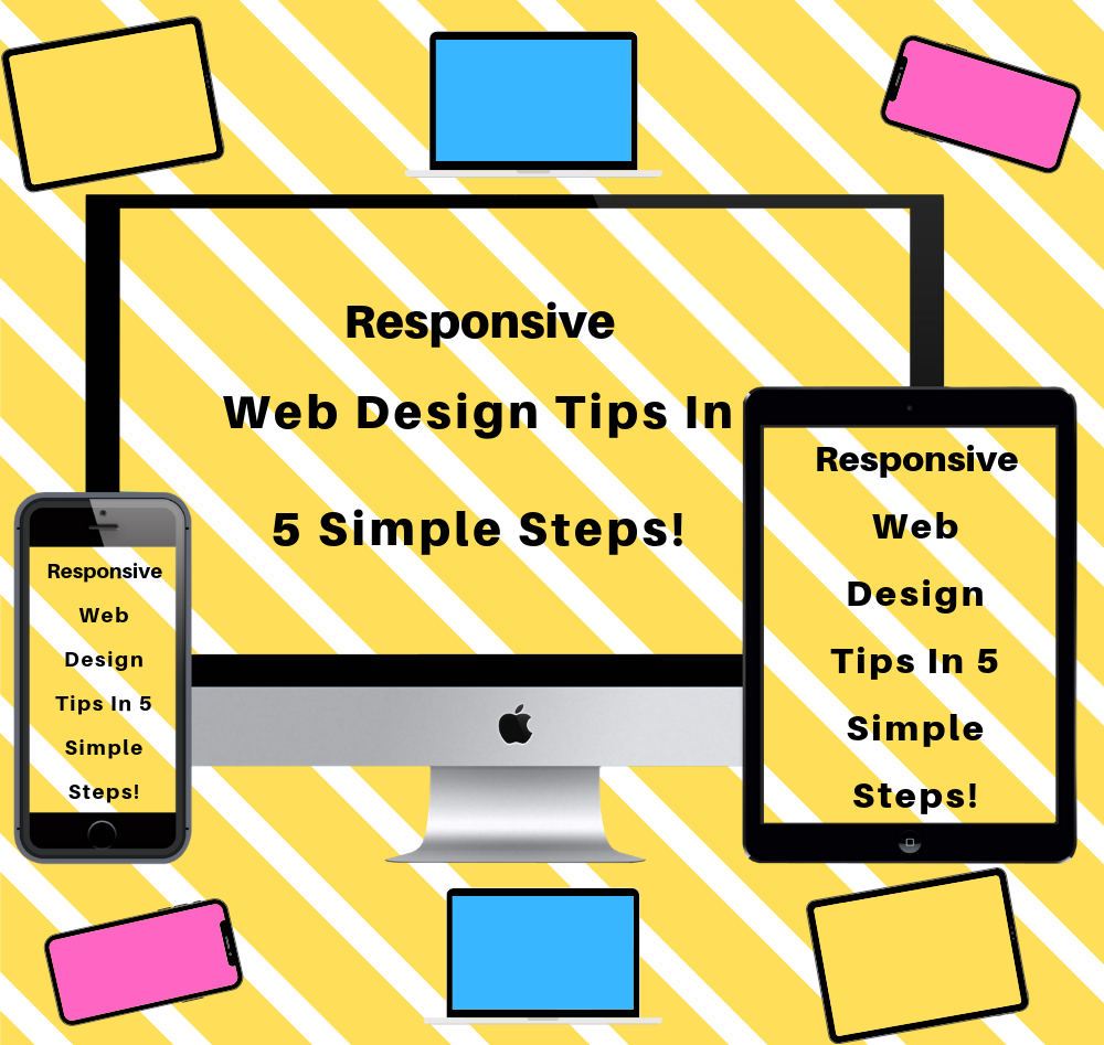
In this era, where people are stuck to their mobile phones and take it as a mandatory step to research well before buying or getting into any deal. It is a must to have a responsive website designed.
In other words, no company can afford to not have a responsive website, where a lot of traffic comes through random mobile surfing!
Keeping the various objectives of owning a website in the notice, here are few tips regarding a Responsive Website design!
- Know how the visitors would use the website!
This might sound very weird but the results and the impact of this are really surprising! Being well versed with the kind of usage visitor makes of one’s website would help developers to know which page should be loaded very quickly and which portions should be shrunken ad made readily available to the people.
- Planning is the best phase to be done first
It is best to create every skeleton framework first and then moving on with the next phase of the designing. Even while moving ahead of designing phase, one of the developers makes it a habit to draft a design framework, using wireframe and then going into the virtual designing part. With all things assembled properly then later the coding part is then taken in hands.
Thereby later, adding one’s website and the designing into a seamless effort creating the best brand identity!
- Navigations are very important to be taken care of
Navigations are very important to be taken care of, these help in linking the important links and pages well in a proper manner. But this step is to be taken care in the very proper sense and is done differently for the users using a website on desktop and for the mobile users.
For mobile users, the practice has been to integrate small links on the hamburger or icons and then integrate the links behind them, but as per recent survey, it is better enough, if one would include the major menu or page links as open and integrating the small page links as icons or the hamburger embedded links!
- Never fail to compress your images!
Images being the very important part of your website play an exciting role in connecting your audience emotional to the content. While images are very necessary to be included, it is definitely equally important to be able to get website loaded easily as well. Thus before using images compress them and use as many as needed!
- Keep Mobile first: Always!
This one helps in making sure that the design been built is doing really well on the small screens. A kind of testing step helps in making sure that all the elements, screens, pages, images and the navigations are working really well. Once working well on smaller screen, their won’t be any problem in bringing changes easily on the larger screens!
Thus, while following few of the points mentioned above, one would get hold of the right traffic appealing Website!